
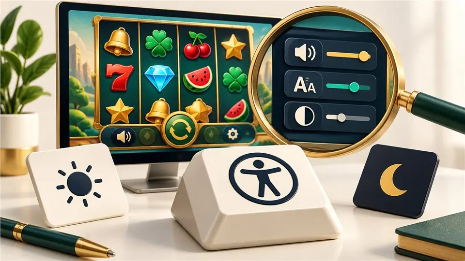
Slot interface accessibility requires more than readable artwork. Check keyboard access, actual touch targets, contrast and moving content in both the page and embedded player. A working Play button or an attractive screenshot cannot establish whole-player conformance.
Can a visitor operate and leave the player?
Check whether a keyboard can reach Play, help, sound settings and the exit control, with a visible indication of focus. Opening a dialog should not strand a visitor inside an interface they cannot close.
W3C’s keyboard guidance explains the need for keyboard-operable functionality, subject to its defined exception for path-dependent input. A single working shortcut is not evidence that every control is accessible.
Painted labels are not necessarily readable labels
Many players draw text and controls inside a visual surface. The fact that a word appears on screen does not mean assistive technology receives its meaning, state or role. A control that looks like a button may not behave like one to a screen reader.
Testing should include actual navigation and announcements, not an assumption that all visible text has a corresponding accessible representation.
Measure text against its real background
Gold text on a bright panel can be hard to read despite looking premium. Moving backgrounds make this harder: a label may be clear in one frame and disappear in the next.
WCAG’s text-contrast criterion specifies 4.5:1 for ordinary text and 3:1 for large text, with stated exceptions. Passing one screenshot does not establish that all states meet the criterion.
Inspect hit areas, not just icons
A thin gear symbol can have a generous invisible target; a large decorated button can have an unexpectedly narrow active area. Test the controls close to stake changes and feature choices especially carefully.
WCAG 2.2’s minimum target criterion accounts for both size and specified spacing exceptions. Its minimum is not a recommendation to cram controls together as tightly as possible.
Movement should not hide necessary information
Continuous decorative motion can make rules difficult to read. A result should remain understandable without relying only on sound, flashing borders or color.
W3C’s pause, stop and hide guidance addresses automatically moving or updating content under defined conditions. It does not say every animation is prohibited, and it does not replace separate assessment of potentially harmful flashing.
Publish findings without awarding an unearned badge
Useful observations identify the tested browser, input method and specific barrier. “The help panel cannot be reached with Tab” is actionable. “Fully accessible” requires a much broader conformance assessment.
If an embedded supplier interface creates a barrier Lupita cannot directly repair, the review should still state it. Ownership of the problem does not make the reader’s difficulty less real.
Sources and review notes
Editorially reviewed 2026-10-08. These are accessibility review questions, not a WCAG conformance certificate for Lupita or any embedded supplier player.
Continue reading

Portrait Slot Mobile Layout: Controls, Rules and Rotation
Discover how vertical layouts redistribute reels, controls and help screens—and why portrait support does not guarantee readable mobile play.

Responsible Slot Demo Interface: Clear Credits and an Easy Exit
Free credits are only one safeguard. Examine honest labels, deliberate launch controls, readable results and a session that does not pressure visitors to continue.

Slot Review Checklist: Rules, Configuration and Testing Evidence
Look for identifiable rules, configuration context and concrete interface observations—not a rewritten provider advert or a score that promises winnings.